Exclusive: Mayhem marketing mockups
Blimey. The Commodore Format Archive is very proud to present to you yet another Mayhem In Monsterland exclusive! Here, Commodore Format writer Andy Roberts – who was also part of the Mayhem team – […]
Commodore Format magazine fan site

Blimey. The Commodore Format Archive is very proud to present to you yet another Mayhem In Monsterland exclusive! Here, Commodore Format writer Andy Roberts – who was also part of the Mayhem team – […]
![mayhem_000[1]](https://commodoreformatarchive.com/wp-content/uploads/2016/03/mayhem_00011.jpg?w=218&h=300)
The following designs were put together late into the night when I was working down at the CF offices for a few days. I can’t pin down exactly when they were made, but it was sometime in ’92 when art editor Lisa Nichols was still on the magazine (I remember this detail as they were done on Lisa’a Mac!). I seem to recall I was working late on some strategy guide that was boring me to tears, so I took some time out to play with a few ideas for Mayhem (based on discussions I’d had with the creators, John and Steve Rowlands).


![mayhem_004[1]](https://i0.wp.com/commodoreformatarchive.com/wp-content/uploads/2016/03/mayhem_0041.jpg?w=186&h=256&ssl=1 "mayhem_004[1]")
My first attempt at playing around with logo ideas is the first image top left of this page. It’s also partly me getting used to Lisa’s Mac software! Even at this early stage you can see that there were issues with the word “in” and this continued to nag at us as we developed the game’s final packaging and advert designs (which explains why the word “in” on the final Mayhem artwork is relatively plain and looks a little out of place! You can see it in the finished advert at the very bottom of this page).
Moving on to the gallery above…With Mayhem 1 I tried something a little different and went with a design that was more reflective of what certain magazines like ZZAP! 64 were doing with their page designs at the time.
Mayhem 2, Mayhem 3, Mayhem 4 (also above)
These show the evolution of a simple logo into a concept that would eventually shape many aspects of the final packaging design (such as the Looney Tunes-style concentric circles and the Super Dinovision logo). The image with the Q&A was related to an idea we’d had to start running teaser adverts, but in the end this strategy was unnecessary due to the high amount of publicity gleaned from the CF diary (chances are, if you read CF or Zzap!64/Commodore Force you knew Mayhem was coming…).


Mayhem 5
Now we’re looking at the second gallery just above. This is a simpler idea using a bitmap picture of Mayhem which Steve Rowlands had created on the Amiga using Deluxe Paint (this was later up-rezzed and embellished considerably to become the logo used on the game’s packaging). There’s also the first mention here of MOOG Ltd., a company which John and Steve were going to set up to distribute the game (MOOG = Mail Order Only Games).
Mayhem 6
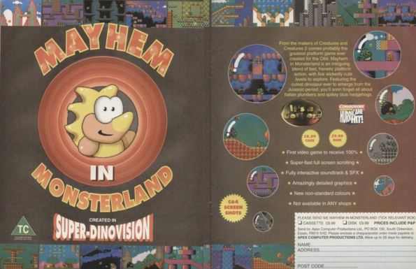
A variation on the previous design, this time looking more like an advert for the game thanks to the addition of some text and prices for the cassette and disk versions. The text is actually pretty close to the final blurb used on the official advertisements, albeit with a couple of changes: John was keen to include the word “jurassic” (as Jurassic Park was all the rage at the time), and the reference to Sonic and Mario were made a little vaguer on the final blurb to avoid any legal ramifications. It’s also interesting to note the “dozens” of levels mentioned – at that time, the number of levels hadn’t been decided.
Mayhem 7
And finally, a mock logo/letterhead for MOOG Ltd., an idea which eventually fell by the wayside during Mayhem’s development (if memory serves, we had a long discussion regarding the Apex brand and how powerful, important, and well-respected it was; it made sense to capitalize on the Rowlands’ formidable reputation and release the game under the Apex name rather than some unknown brand). CF