Commodore Format 33 (June, 1993)
A look at the June 1993 issue of British C64 magazine, Commodore Format.
Commodore Format magazine fan site

A look at the June 1993 issue of British C64 magazine, Commodore Format.

When Commodore Format launched, editor Steve Jarratt thought the magazine would be good for “two, maybe three years”. He was saying as such with an eye on the fortunes of the Commodore 64, and in that respect he was right: here we were, two-and-a-half years down the line and the machine was almost commercially dead. With a mere handful of further releases planned, it seemed to be the end.
Except for one thing. Commodore Format was still selling tens of thousands of copies a month. Whether they were hardcore enthusiasts or people who’d had their computer handed down to them, enough people were still buying the magazine to make it worth Future Publishing’s efforts – and so it marched on, even if the games didn’t. A new era called for a new sort of Commodore Format, and this month – issue 33 – we got one.

The first thing you notice when you pick up a copy is how much more premium it feels. CF had gone up market. The cover is glossy and the paper wider, shinier and thicker. Inside, an entirely redesigned magazine took advantage of new developments in desktop publishing and printing technology to use brighter – sometimes neon! – colours. It’s a world away from the simple whites and reds of the original Commodore Format and it isn’t unreasonable to say the newer design has aged less kindly. But if you stop to think about the year 1993, it all makes more sense: kids were wearing neon socks and Global Hypercolor t-shirts. The magazine was actually very contemporary, even if 25 years later it looks garish.
BUT WHAT ABOUT THE WORDS?
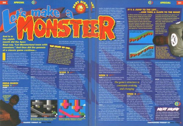
It wasn’t just the look of CF that was different. As we said up there, it was a new magazine for a new C64 age. With fewer (and soon to be no) games going onto the shop shelves, editor Trenton Webb repositioned Commodore Format as an enthusiast and knowledge mag. Issue 33’s cover didn’t feature a new game release for the first time since issue 1, instead choosing to go big on a piece exploring what makes the perfect driving simulator. Inside, a smaller games preview section quickly gives way to a barrage of in-depth features, the sort of which we hadn’t seen since CF‘s early days: after the driving piece, The Rowlands Brothers are up with a behind-the-scenes look at the making of Mayhem In Monsterland.
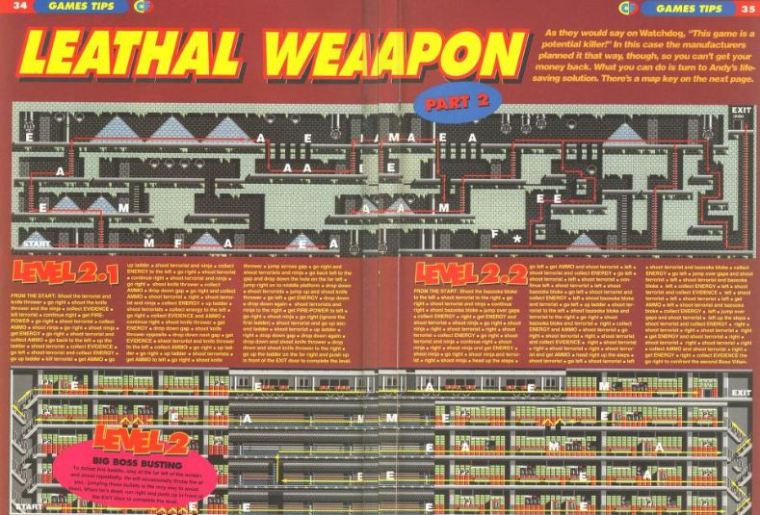
It’s followed by Bones’ article on making sprites, backed up with a utility on the cover tape. Over the page you find the first in what would become a regular column exploring public domain. Gamesbusters is next, with more colour and maps than ever, and the centre pages are dedicated to a reveal of the recent reader survey results on which the redesign was based. Half of CF‘s readers were, it said, between the age of 11 and 18, with a quarter between 18 and 50. The favourite game was Creatures 2, followed closely by Rainbow Islands. And the most owned “other” machine? The Nintendo Gameboy.
AN IGNORED CLASSIC
OK, the big games hadn’t completely dried up, but Sleepwalker was Ocean Software’s last Commodore release. This highly unusual game about a dog guiding his sleepwalking owner to safety, utilising washing lines, window ledges and avoiding pedestrians is a technical marvel and a lot of fun. It notched up 90% – one of CF’s final ever Corkers – and it’s a damned shame more folk don’t know about it. If it had dropped in 1989, it’d be known as a classic.
The rest of the month’s reviews are double page spreads of budget games and re-releases that mere months earlier would have received just a paragraph in the old Roger Frames’ column. If you didn’t want to believe the machine was in trouble before, surely this would convince you. The new design worked brilliantly, though it did occasionally smack a bit of trying to fill the pages – and Trenton has told us that’s exactly what it was – but CF‘s new direction was encouraging. The magazine felt more complete; not just a string of reviews, but a fuller package. Over the coming months, with virtually no games to review, the magazine would respond by producing some of its best content ever. And next time, we’ll see the team pull something truly special out of the bag. CF
ON THE POWER PACK
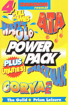
One thing’s for sure: the cover tape budget had been cut in 1993, and the magazine’s supply of Hewson games bought in a 1991 deal were running out. This tape’s OK, but hardly the sort of classic people remember over on our social media page. Snackman was a Pacman clone, the second to ever grace CF (The Blob had featured back in issue 2). Corya was the second part of the running text adventure, ATA was essentially Tetris and Sprite Demo accompanied Bones’ feature in the mag. The highlight of the cassette was the quirky Water Polo, which was both authentic to the sport and pretty good fun. The tape’s still got a couple of good stories behind it, which we’ve unearthed in our feature here.
AND FINALLY
If you’re going to make a mistake, you might as well make it in big, neon letters eh? No doubt, working on a redesigned mag for the first time involved some late nights and tired eyes. See if you can spot the subtle spelling mistake here 🙂